Generative typeface classification
12/08/2022
Generative type
Generative typefaces are a recent development in the history of typography, made possible by the advent of digital technology, to harness the power of computers as collaborators. At its core, generative type is about using rule-based systems to form glyphs, which typically involves the use of algorithms and software to carry out a number of steps.
Although this description could be used to talk about any digital font, what differentiates generative typefaces from the everyday digital font, is that they use computational methods in a creative manner, often involving data that is dynamic instead of static. This relegates substantial aspects of glyph design solely to algorithms predefined by the designer, and in many cases, relies on external data coming from neither the designer nor the computer. Generative faces can also fall under a larger classification of experimental typefaces.
Personal computers Digital type would not be possible without access to computing, dating back to the 1950s and 1960s, when the first computers were developed for use in business and scientific applications. These early computers were large, expensive, and difficult to use, and were primarily operated by trained professionals.
In the 1970s and 1980s, the development of new computer technologies and the introduction of the personal computer (PC) began to make computing more accessible to a wider audience. The first commercially successful PC, the IBM PC, was introduced in 1981, and was followed by the release of other popular personal computers, such as the Apple Macintosh in 1984 (Britannica 2022).
Digital tools The emergence of new tools changed both processes and outputs of type designers. In 1966, Rudolf Hell invented the first fully digital typesetting system, and created the first digital font, Digi Grotesk, in 1968 (Blandino 2021). While working on the TeX typesetting system for mathematical and scientific documents, Donald Knuth, a computer scientist and professor at Stanford University, created MetaFont, a description language that uses computational rules to define the shapes of glyphs and the relations between them (TeX 2017). The initial development of MetaFont began in the late 1970s, and it was first released to the public in 1979.
PostScript, a page description language developed by Adobe Systems in the early 1980s, allowed computers to turn vector fonts into information to send to the first laser printers on the market. It was designed to be used in conjunction with the company's first laser printer, the Adobe LaserWriter, which was introduced in 1985.
Digital font formats The first digital fonts were created using simple bitmap pixels. These early fonts were limited in their capabilities, as they could only be displayed at fixed sizes and lacked the sharpness and clarity of traditional printed fonts. In the 1970s, vector fonts were developed, which defined glyphs in mathematical equations known as Bézier curves, greatly increasing the scalability of characters. In the 1990s and 2000s, the widespread adoption of the Internet led to the development of web fonts, which are fonts designed specifically for use on web pages. More recently, the introduction of variable fonts in 2016 has provided new levels of design customization in a single font file, making it easier to optimize type for different display environments, and opening new possibilities in the world of generative type.
Impact on type design Digital technology has had a big impact on typography. It has significantly improved the efficiency of the design process. Instead of needing an entire team with specialized roles such as punchcutters and designers, one person with a computer could complete the entire development of a font from beginning to end. This has also lowered the barrier to typeface design, allowing more people to make more fonts in less time, and expanding the range of design possibilities for faces.
We have seen generative typefaces emerge as new tools help designers make fonts with different levels of complexity and detail than before. Computers have changed the way designers think about and approach their work. With physical tools, designers had more direct control and visual feedback on their outputs. With digital tools, many designers had to shift their thinking in terms of rules to communicate outputs that could be understood and interpreted by computers.
Imperfect typefaces Technology has provided the ability for designers to create fonts with a high degree of precision and standardization. This has lead to the creation of many high-quality faces, but has also contributed to the decrease of faces that have a more organic or human element, as each letter looks exactly the same. As a response to this trend, designers found ways to hack digital fonts, often incorporating elements of randomness, to simulate imperfection across text. This method can be considered generative as the computer is following a set of rules to generate varied letterforms, with a level of unpredictability in the hands of the one who types.
The first typeface of this genre was FF Beowolf by Erik van Blokland and Just van Rossum in 1989, known as “the original RandomFont” (Fig. 1). Van Rossum says, “For reading, sameness is not necessary: we can read handwritten text, type superimposed on flickering TV images. The sameness of type seems an arbitrary thing that we can do away with in certain cases.”
The designers found a way to hack PostScript by substituting its programming commands, with their own command that causes a letter to be randomly generated with erratic outlines (MoMA 2011). Interestingly, Just van Rossum is the brother of Guido van Rossum, the creator of the Python programming language, which became a dominant programming language in the fields of type design and font engineering, used by Hoefler, Adobe, and is the basis of several typeface design tools (Jockin 2016).
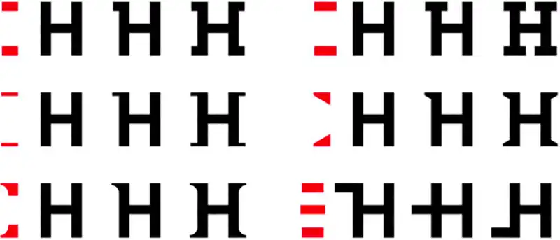
From a distance, FF Beowolf may seem like a normal serif. Its features may even be unnoticeable with the lowest level of randomization, and could look like an uneven, slightly splotchy ink job occurring in physical printing. However, as the randomization numbers increase, the glyphs become more and more spiky, and the legibility decreases. The sharp outlines of R24 are, no doubt, the result of a machine. When viewing a line of text, it almost seems as if the words were written on a piece of paper, crumpled up, stomped on, and someone then attempted to flatten the paper. I can imagine this font being used on an album cover for an underground rock band, or the heading of a thinkpiece on the societal impacts of artificial intelligence.

Another example of an “imperfect typeface” is Tobias Frere-Jones’ FB Reactor (Fig. 2), designed in 1993 for FUSE magazine, and released in 1996 by Font Bureau. Christopher Hamamoto (2012) has described Reactor as “a typeface inspired by a burning building and its ruins, in which the lowercase letters contain copies of other characters that extend beyond their margins into the neighboring characters adding variable levels of distress that increase the more type is set.”

Modular typefaces A modular typeface is created using a set of components that can be combined and rearranged to create a wide range of letterforms and variations. This approach can allow designers to create flexible and adaptable fonts that can be easily customized and adjusted to fit different design contexts and needs.
Modular type can be considered generative because the designer needs to define a set of rules, typically characterized by the different modules of a glyph and how they can be exchanged. Then, it is up to the consumer, the computer, or a mix of both, to put together their version of the font. Digital technology plays a big part in a new wave of modular typefaces, as advances in computing capacities have made it possible for computers to carry out complex rules and generate variations quickly. Further, this has made it easier for designers to provide interfaces for people to interact with their modular components and participate in the creation and personalization of fonts.
An early example is Matthew Carter’s Walker (Fig. 3), designed in 1995 for Walker Art Center, which features “‘snap-on’ serifs and the ability to apply lines above, below, or through the middle of letters and words. Through a series of keyboard commands, a user can add a variety of serifs—tapered, slab, wedge—to different locations on a letterform.”
This paved the way for newer faces such as Phase by Elias Hanzer (2019), who describes the project as a “generative type concept…systematically designed with modular components, which form the base for an infinite number of shapes.” Hanzer developed a set of components (Fig. 4) alongside a web application for people to try different “phases” and download the “typephase”. Phase also uses variable font technology for website visitors to manipulate phases in real-time or with sound via voice input.

In Phase, each variation created by a different combination of components is considered a “phase” and appended with a corresponding string to serve as a unique identifier (Fig. 5). The different phases feel modern, carefree, and fun, partly due to the distinct contrast between heavy and thin strokes, and the round protrusions evident on many of the rounded areas of glyphs such as ‘P’, ‘a’, and ‘0’. In some combinations, the ‘a’ and ‘s’ are disconnected at the center, while others overlap. I can imagine the phases being used in logos and display type for playful consumer-facing brands targeting millennials and younger generations, which would pair well with bright contrasting colours.

Interactive typefaces Interactive typefaces invite people to be a part of the typeface design process, through translating user inputs into glyph manipulations, often in real time. The role of the designer is to define the rules in which inputs map to changes in glyphs, which makes these fonts generative in nature. Digital technology has enabled many possibilities for interactive type, as we can capture data in new ways. For example, designers can use hardware and sensors to gather haptic information, microphones to receive sound, and cameras and computer vision to analyze body movements and expressions.
One example of an interactive typeface is Laika, designed by Michael Flückiger and Nicolas Kunz in 2009 for their bachelor thesis at Hochschule der Künste Bern, Switzerland. The designers question the role of digital type, asking “Why should a typeface be rigidly set, if it is not going to be printed? In a dynamic medium, why shouldn’t the form and the character of the typeface be understood dynamically as well? Why shouldn’t its forms change, transform, and respond to circumstances?”
Flückiger and Kunz set up various installations showing Laika’s potential to change between different weights, contrasts, serif lengths and italic angles, through interactive, audiovisual inputs, data requested from the Internet in real-time (RSS feeds), and electronic components such as sensors or simple switches (Fig. 6).

Performa (Fig. 7) is another interactive typeface by Kyuha Shim, a computational designer, researcher, and lecturer based in London, who is completing his PhD in Visual Communication at the Royal College of Art. Shim describes Performa as “a generative system…responsive to the users when typing…When a key on a keyboard is pressed, the corresponding letter or symbol appears and continuously extends in form until the key is released. The measured time lapse between the two actions dictate the length of the extensions, and the pressure with which the keys are pressed dictate the width of the strokes.” Shim created Performa to question how the tension and speed of the writing hand beneath the text can be communicated into today’s digital culture (2014).
Performa is a sans-serif family with rounded strokes. The straightforwardness of the lines and geometric shapes give a futuristic impression. The solid font is readable, but as additional lines are added and stroke width increases, the letters gradually start to look like series of intersecting lines. The width of each character is quite wide, especially when the user is typing more slowly. This makes sentences look like they have been flattened and stretched out. I can see how typing with this setting may instill more urgency in the user to type quickly and achieve more readable forms.
As the pressure on the keyboard increases, the strokes also become thicker. To me, this is an appropriate translation – if someone is angrily hitting their keys, I would imagine a bolder output. If someone were to read the words out loud, they might drag out the longer letters, and yell the heavier words. Due to its reactive nature, Performa could be used in media such as lyrics for music videos, or title sequences for TV shows.

Time series typefaces Time series typefaces are created using time series data, which is a sequence of data points that are measured at regular time intervals, often used in data analysis and modeling to study patterns over time. Digital technology has greatly facilitated the analysis of data by providing powerful tools and platforms for storing, processing, and visualizing large volumes of data. With the help of computers, we can perform more complex analysis, such as machine learning and predictive modeling, which can help identify trends in data.
In generative type design, this has allowed us to create font families that are representative of data at different periods in time. With time series typefaces, glyphs are typically manipulated based on changing values of data. This could also be used to create animated fonts that change over time, allowing us to visualize the data in a dynamic and engaging way.
Occlusion Grotesque (Fig. 8) was a 5 year project in which Bjørn Karmann carved a font into a tree and captured how the growth of the tree modified the characters over time. The data was then used to train a generative model, where any starting shape can be inputted for tree growth to be projected on. Karmann (2021) achieved this by introducing a growth vector at intervals of one year to the dataset labels, although the steps can be interpolated into smaller chunks of time once the model generates new outputs. Each year represents a different font weight.

Another example of a time series typeface is Climate Crisis by Daniel Coull, a variable font made in 2020 for Helsingin Sanomat, the largest Nordic newspaper. The face uses data of Arctic sea ice levels from 1979 to 2019, and predictions for 2050, to visualize the urgency of climate change.
The 1979 weight boasts thick strokes, with sharp edges and very minimal white space inside and between letters. These characteristics add a lot of personality to the font. However, these qualities slowly deteriorate as we reach 2050. Clearly defined curves sink inwards and get deformed. The upper and lower curves of the lowercase ‘a’ slowly disappear, and the once straight stroke endings are shaved off as they become pointy. The overall height, weight, and white space of letters also decreases. As these changes take effect, the emotions of the font also change. What was once confident and legible is now haunting and hard to read. Climate Crisis serves as both a typeface and a data visualization. It can be used for posters to spread awareness of climate change, or in informational videos that demonstrate rapidly melting ice levels.

References Blandino, G. (2021, September 17). The birth of digital fonts. Bourton, L. (2019, January 28). Phase, a generative type tool by Elias Hanzer, manipulates letters by hand or sound. It's Nice That. Britannica, T. Editors of Encyclopaedia (2022, September 20). personal computer. Encyclopedia Britannica. Coull, D. (2020). dancoull/ClimateCrisis. GitHub. Data and logic in type: Kyuha Shim on his amazing algorithmic typographic quest. (2021, October 29). TypeRoom. Flückiger, M., & Kunz, N. (2009). Laika - a dynamic typeface. Laikafont.ch. Hamamoto, Christopher. (2012, December 27). FUSE 1–20 – Typographica. Typographica. Jockin, T. (2016, May 28). Learning Python Makes You A Better Designer: An Interview with Just van Rossum. Medium. Karmann, B. (2021). Occlusion Grotesque. Bjørn Karmann. MoMA. (1990). FF Beowolf. MoMA. TeX. (2017). What is MetaFont? The TeX FAQ.